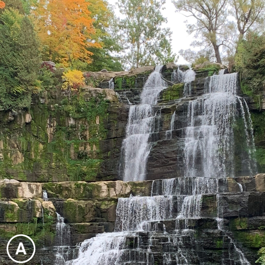
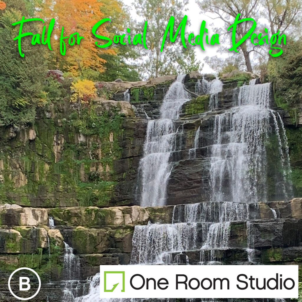
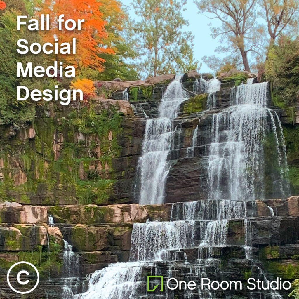
These days, social media isn’t just about finding an image and dropping it into your feed. Here’s a picture that I took on a recent trip to Chittenango Falls in Central NY. I like it so I decided to use it for this demo, but it could be any image. Maybe a shot of a new product, a restaurant’s featured dinner special or something you need your audience to see. Check out how showcasing this 3 ways takes it through A-Good, B-Better, C-Best:
Option A
…takes the picture and crops it for Instagram. A nice shot. But pretty easy to scroll past, and no association with your business. What if it was a big dinner special for your restaurant, or a new hair-style that you’re proud came from your salon? Your Audience may miss it. (Also, it makes it pretty easy for someone to lift this and claim the work as their own!)
Option B
…better…at least a logo is in there, and a title to tease the subject of the post. But not knowing (or having access to) the correct graphic format leads to a big white box intruding on your image. And the headline font and color isn’t exactly on brand. (Not that a script font, when used consistently and sparingly can’t be part of a brand’s toolkit, but proceed with caution!)
Option C
…it’s a good place to be. The headline is noticeable, in the brand typography, and smartly sized and placed. The logo is clear but unobtrusive, and the best format is used to keep it legible (in this case, a full knock-out to white). As a bonus, I punched up the vibrancy of the colors to catch scrolling eyes. (See how One Room Studio implemented this approach with this local race campaign: https://www.instagram.com/the_run_before_christmas)
So, are you ready to kick your Social Media game up a notch or two? Fill out this form to find out how, and to get a quote—monthly packages start at $99!


